The idea behind, and the process
LE SSERAFIM’s brand only uses one typeface for every album release, which is not bad, but I would like to create a new typeface illustrated by hand to demonstrate the feel of the theme of their album “UNFORGIVEN”. In other words, I’m rebranding the look of the album. The narrative of the album is about strong, confident, fearless females so I knew that I wanted the type to look “edge” – influenced by the hip-hop and graffiti culture. I first sketch the typeface on my notebook and then I cut the individual letters off and illustrate them on Illustrator. I also experiment with different compositions and text effects to get the final results.

CD mock-up with the new cover for LE SSERAFIM's album "Unforgiven", featuring the hand-customed typeface done by me.

Digital Cover


Alternative Digital Covers

CD mock-up

Sketches of the letters used in the typeface

Banner using the alternative typeface

Member's names poster, using the alternative tpeface


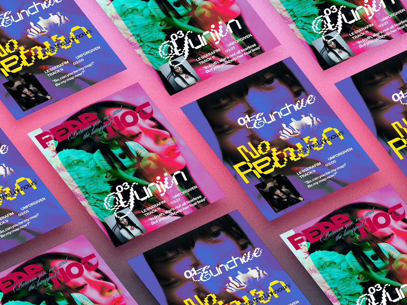
Additional promotional posters for new songs on the album
This is my love letter to K-pop music and an experiment with layout compositions and typography combinations. I also mock the posters up to illustrate how they would look in real life.